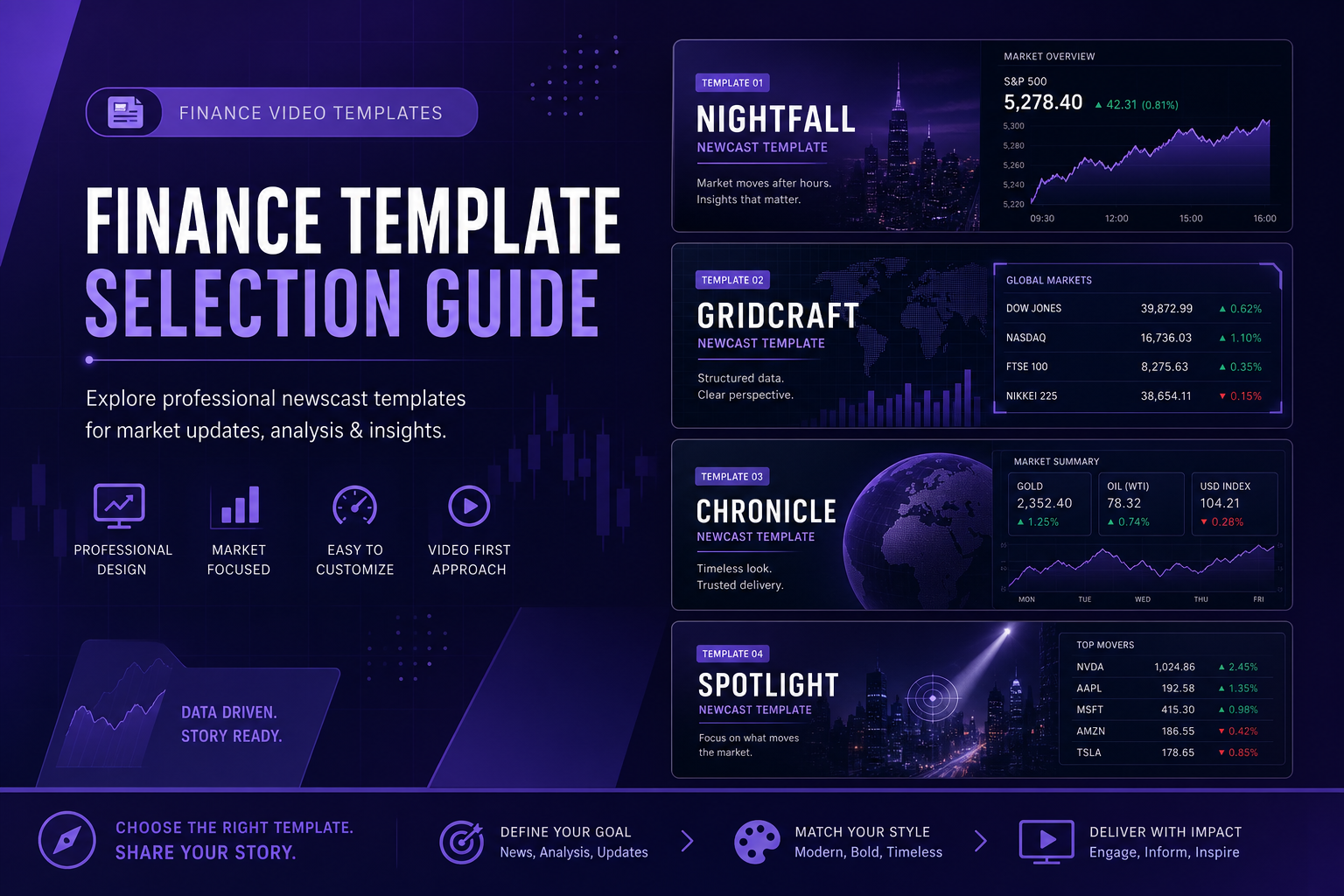
Template guide
The Best Article Video Studio Templates for Finance and Market Analysis Content
A complete guide to choosing the right Article Video Studio template for finance newsletter content, market commentary, research breakdowns, and investment analysis — with specific recommendations by content type.
Overview
TL;DR: A complete guide to picking the right Article Video Studio template for finance content — market commentary, research breakdowns, and investment analysis — with specific recommendations by content type.
The template you choose for your finance video determines how your content is perceived before a single word of your analysis is heard. In finance, where credibility is established visually in the first few seconds, this matters.
Here's a breakdown of which Article Video Studio templates work best for different types of finance and market analysis content, with specific recommendations and use cases.
Why Template Choice Matters in Finance Video
Finance audiences make credibility assessments fast. A viewer landing on a finance video decides within 3–5 seconds whether this is content worth watching — and a significant part of that decision is visual.
The templates that perform best for finance content share a few properties:
1. Dark or structured backgrounds — signal professionalism and seriousness
2. Data graphic capability — numbers appear on screen as styled graphics, not just spoken
3. High information density — the layout handles multiple elements (text, graphics, narration) without looking cluttered
4. Clean typography — readable at a glance, without decorative elements that distract from the content
The templates that underperform for finance content are typically designed for lighter, more consumer-facing content — bright backgrounds, expressive typography, lifestyle aesthetics. These can undermine credibility for analytical content regardless of the quality of the analysis.
Template 1: Nightfall — Best for Market Commentary and Macro Analysis
Visual identity: Dark glass panels, neon-accented data graphics, high contrast Feel: Bloomberg terminal meets premium financial media Best for:
1. Weekly macro commentary
2. Interest rate and yield analysis
3. Market structure commentary
4. Premium newsletter content (paid research, institutional positioning)
5. Sector rotation analysis
Why it works for finance: The dark background with clean data graphics is the visual language of professional financial media. Bloomberg, Reuters, financial news terminals — the aesthetic is deliberately sober and data-forward. Nightfall uses this same visual grammar to signal that the content is serious, analytical, and worth professional attention.
When to use it: When you want viewers to immediately perceive your analysis as authoritative. When your content deals with macro conditions, monetary policy, or market structure — topics where credibility is particularly important. When your audience includes fund managers, advisors, or finance professionals who will judge production quality against professional financial media.
Example content that works well:
- "Why the Yield Curve Is Signaling Something Different This Time"
- "The Three Macro Forces Driving Rate Decisions Right Now"
- "Q3 Earnings Season: What the Aggregate Data Shows"
Template 2: Gridcraft — Best for Company Analysis and Framework Content
Visual identity: Editorial bento-grid layout, clean white/neutral backgrounds, structured information hierarchy Feel: Analytical, organized, high-information-density without being dense Best for:
1. Single company or sector deep dives
2. Framework and concept explainers ("What is X")
3. Comparative analysis (X vs. Y)
4. Weekly market breakdowns structured by theme
5. Content for a general finance audience rather than institutional
Why it works for finance: Gridcraft's grid-based layout naturally organizes information into parallel visual units — company vs. company, thesis vs. counter-thesis, data point vs. data point. This is how financial analysts think, and the visual structure reflects it.
When to use it: When the content is structured and organized, with clear sections or comparison points. When your audience is more retail-sophisticated than institutional. When the content is analytical but needs to be accessible — not just specialists.
Example content that works well:
- "Breaking Down [Company X]'s Q3 Results: Revenue, Margins, and Guidance"
- "5 Stocks That Look Interesting After the Selloff"
- "How to Value a Business Using EV/EBITDA"
Template 3: Chronicle — Best for Research-Backed Deep Dives
Visual identity: Document-forward layout, emphasis on text hierarchy and data presentation Feel: Academic credibility with visual structure Best for:
1. Long-form research breakdowns
2. Evidence-heavy analysis (multiple studies or data sources)
3. Historical context pieces ("What Happened Last Time X Occurred")
4. Deep dives where thoroughness is the main signal of credibility
Why it works for finance: Chronicle's document-forward visual style signals that this is serious research, not quick takes. For finance content where the depth of analysis is the differentiator, Chronicle's aesthetic reinforces the credibility of the underlying work.
When to use it: When the content is explicitly research-backed and you want the visual style to signal intellectual rigor. When your audience includes people who will share the content to their networks specifically because it's well-sourced. When the piece is a major work rather than a weekly update.
Example content that works well:
- "The Historical Pattern When the Fed Pauses: Analysis of the Last 6 Cycles"
- "What Small-Cap Valuations Look Like at Every Market Peak Since 1990"
- "Three Research Papers That Changed How I Think About Market Timing"
Template 4: Spotlight — Best for Big Calls and Contrarian Takes
Visual identity: Bold kinetic typography slamming into frame, high-energy visual rhythm Feel: Conviction and urgency Best for:
1. Strong directional calls ("I think [X] is going to happen")
2. Contrarian takes that challenge consensus
3. Breaking analysis on a major market event
4. Short-form content for LinkedIn and social where high energy drives engagement
Why it works for finance: When you have a strong conviction view, the visual style should match the energy of the argument. Spotlight signals confidence and urgency — this is not measured, balanced commentary. This is a call.
Caution: Overuse of Spotlight dilutes its impact. If every video uses bold kinetic typography, none of them signal anything special. Reserve Spotlight for your most important or contrarian content.
When to use it: When you're making a specific, directional, time-bound call. When the content is explicitly opinion-forward rather than balanced analysis. When you want high engagement (comments, shares) on a specific piece.
Example content that works well:
- "Why I Think [Asset Class] Is the Most Mispriced Asset in the Market Right Now"
- "Consensus Is Wrong About [Topic]: Here's My Counter-Argument"
- "The Trade I'm Watching Closely in Q4"
Template 5: Newscast — Best for Data Releases and Market Event Coverage
Visual identity: Broadcast lower thirds, chyrons, TV-style data graphics Feel: Financial news broadcast Best for:
1. Coverage of specific economic data releases (CPI, jobs report, Fed decisions)
2. Earnings season roundup content
3. Market event coverage (major selloffs, rallies, sector rotations)
4. "Here's what just happened" analysis immediately after a major event
Why it works for finance: The newscast format is native to how financial events are covered in professional media. When a major macro event happens, viewers expect broadcast-style coverage. Newscast delivers that context immediately, before the viewer has processed the content.
When to use it: When your content is event-driven and timely. When the specific moment (jobs Friday, FOMC day, earnings season) is the hook. When speed is as important as depth.
Example content that works well:
- "CPI Print Breakdown: What This Number Means for Rate Expectations"
- "Fed Decision Day: My Real-Time Analysis of Today's Statement"
- "[Company X] Earnings: Revenue Miss, Guidance Cut — Here's What I'm Watching"
Template Selection Decision Framework
- Macro / rate commentary — Recommended Template: Nightfall · Why: Signals premium analytical authority
- Company / sector deep dive — Recommended Template: Gridcraft · Why: Clean structure for comparative analysis
- Research-backed deep dive — Recommended Template: Chronicle · Why: Academic credibility signal
- Big call / contrarian take — Recommended Template: Spotlight · Why: Conviction and urgency
- Data release / event coverage — Recommended Template: Newscast · Why: Native broadcast format for timely events
- Concept explainer ("What is X") — Recommended Template: Gridcraft or Geometric Explainer · Why: Educational, accessible
- Premium subscriber content — Recommended Template: Nightfall · Why: Premium aesthetic matches premium positioning
Voice Pairing for Finance Content
Template choice works with narrator voice choice. For finance content:
Measured authoritative voice — pairs with Nightfall and Chronicle; signals that the content is serious and considered Clear analytical voice — pairs with Gridcraft; signals organized, logical thinking Energetic confident voice — pairs with Spotlight; matches the conviction of a directional call
Keep the same template/voice pairing across all videos in a series. Consistency builds the brand recognition that comes with 20+ videos in a consistent aesthetic.
Frequently Asked Questions
Can I switch templates between videos, or should I always use the same one?
Most finance creators use a primary template for regular content (Nightfall or Gridcraft) and a secondary template for a specific content type (Newscast for data releases, Spotlight for big calls). This keeps the channel consistent while allowing for clear visual differentiation between content types.
Does the template affect how the AI structures the scenes?
No — the AI scene structure is determined by the source content, not the template. The template affects the visual design. The same text generates the same scene structure regardless of which template you use.
Can I customize the colors within a template to match my newsletter brand?
Yes. Template color settings can be adjusted. For creators with established brand colors (a specific accent color, a specific background style), applying those colors to the template creates a more cohesive identity across video and newsletter.
What's the most important template decision for someone just starting out?
Pick one and commit. The consistent use of a single template across your first 15–20 videos creates brand recognition that a rotating selection of different templates can't. For finance content, when in doubt, start with Nightfall — it's the safest choice for signaling credibility.
Is there a template that works for both LinkedIn short-form and YouTube long-form?
Gridcraft and Nightfall both perform well across lengths. The template itself doesn't change; you adjust the video length by the scope of content you feed it. A 2-minute version and an 8-minute version of the same template look equally professional — the length is determined by your content, not the visual style.